Your nonprofit’s website is the most crucial form of media for your nonprofit to maintain, acting as the face of your organization and the place in which viewers will learn about the nature of your organization. It is also the most utilized venue for supporters to make donations and contributions.
Whether you are starting fresh with your nonprofit’s website or undergoing a redesign, it is important to keep in mind some best practices in form and content. Read on for six pointers on what to include in any nonprofit website.
1. Your mission statement should be visible upfront, and on the home page.
All nonprofit websites need a clearly articulated, well-placed mission statement so that viewers know exactly what your nonprofit is about. Supporters need to be engaged quickly on your website (within a few seconds) or else they will click elsewhere. Need tips on crafting a great mission statement? Read more about that here.

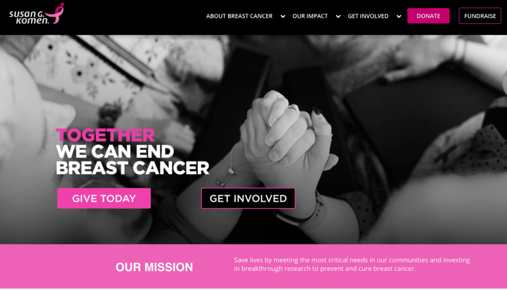
The Susan G Komen website showcases empowering imagery, clear and bold calls to donate and volunteer, as well as their mission statement spelled out right at the start of their homepage.
2. Use visual storytelling.
Incorporate photos and videos that visualize the work that your nonprofit does. Include video interviews and footage of your work on the field, testimonies of your constituents, and the voices of your staff and volunteers. These elements contribute to the overall human voice of your organization and are far more impactful to viewers than plain text. Learn more about effective storytelling here.
3. Make your content interactive.
Use of maps, slideshows, and animations, within tasteful limits and curation, are encouraged. But be careful to not overload viewers with flashy media, and maintain as clean and modern an aesthetic as possible.

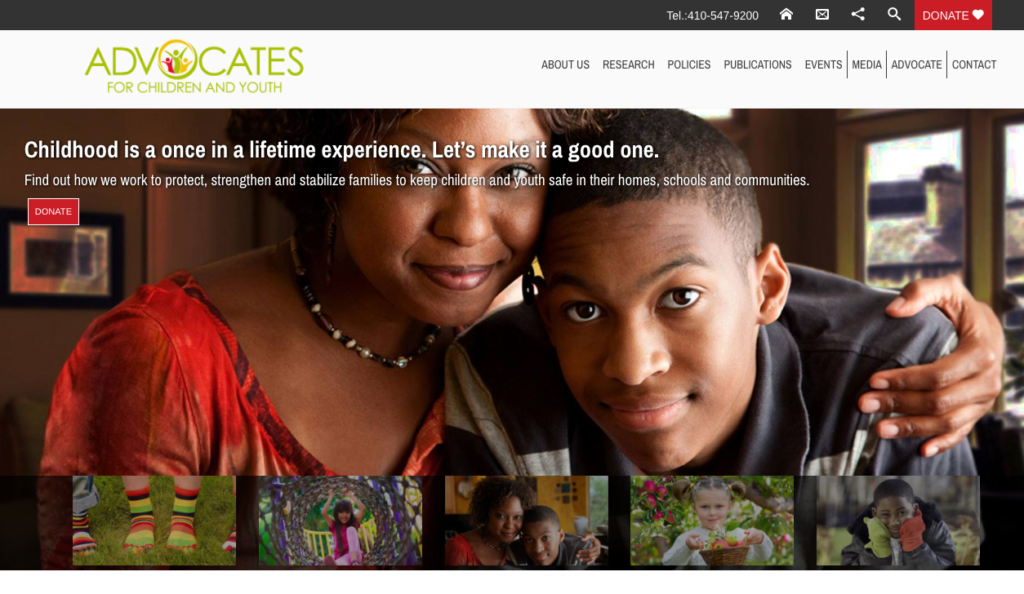
Advocates for Children and Youth’s website features compelling photos, an interactive slideshow, a good idea of what their organization is about, and clear calls to donate right above the fold.
4. Keep a consistent “Donate” button within reach.
Viewers should be able to easily access your donate page, be it in a floating navigation or in a consistently placed link on every page of your website. This button should be especially visible on your homepage, where users can expect to access the most pertinent content.

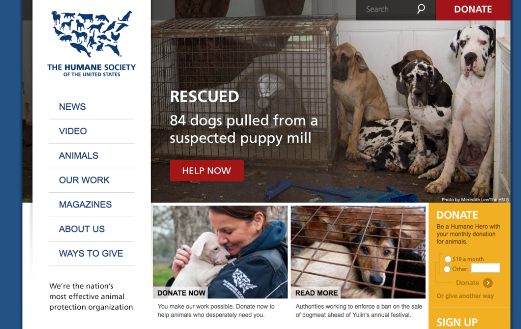
The Humane Society incorporates several ways to donate right off the bat. Their site also integrates powerful imagery and their mission statement upfront.
5. Your site must be mobile-friendly.
Over the past year, mobile browsing of the web overtook browsing on a computer, and this trend only continues to rise. To keep viewers on your site, your website needs to be optimized for mobile so your supporters have the best possible browsing experience. This typically entails having a vertical layout, using larger fonts, and limiting the number of elements per page.
6. Make it easy to keep in touch and stay engaged.
Your site should include an easily located contact page, with links to your organization’s email address, social media, and mailing list. Facebook, Twitter, Instagram, and LinkedIn are all excellent complements to an organization website, all of which allow your supporters to see updates from your organization and stay engaged with your work. Read more about must-have social media platforms for your nonprofit here.

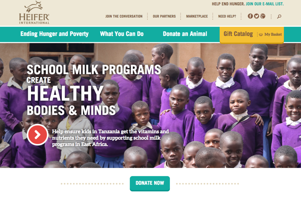
Heifer International’s website features a prominent donate button and demonstrates visually and with simple text what the organization is about (ending hunger) within a few seconds of viewing their page. It also includes easily found social media links at the top of the navigation.
What is essential for your nonprofit to include on its website? Do you have advice for beginning nonprofits structuring their image online? Share your tips in the comments!
Pro tip: Don’t have the time to lead a redesign, but still need to upgrade your website? Flipcause offers free website modernization services with most subscription plans, where your existing content is transferred to a modern, mobile responsive site that focuses on supporter engagement. Request a demo to learn more about this free service!

0 Comments